Image unavailable
+
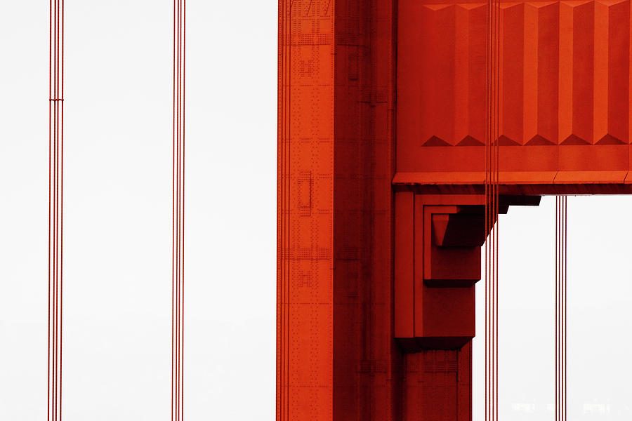
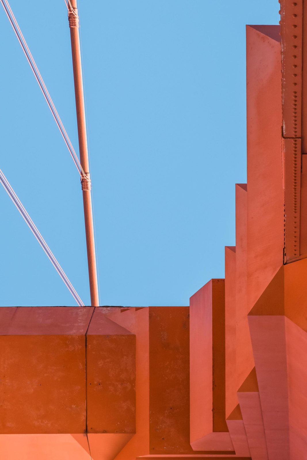
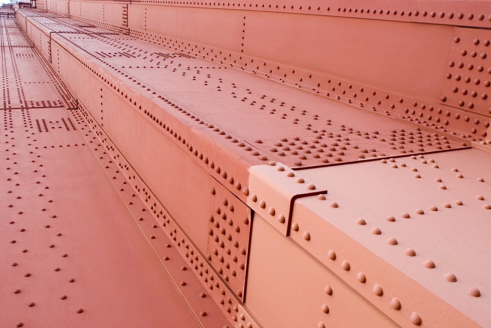
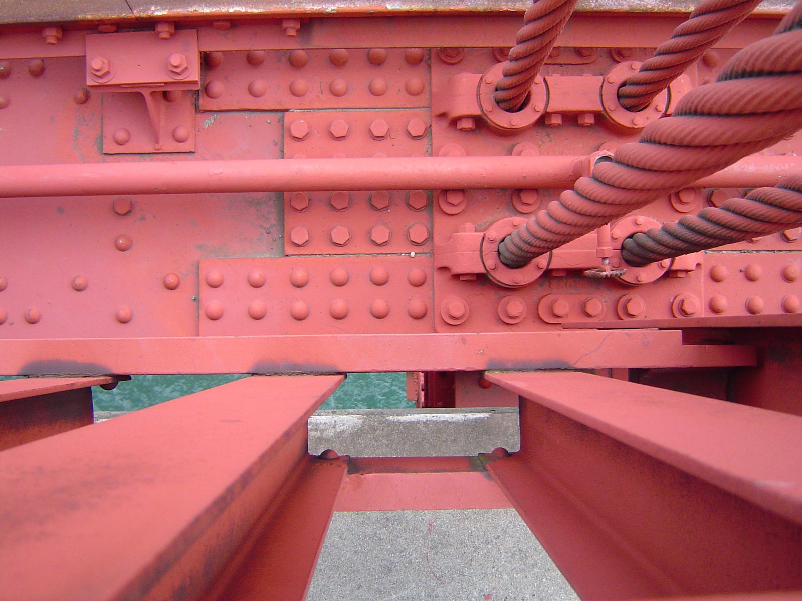
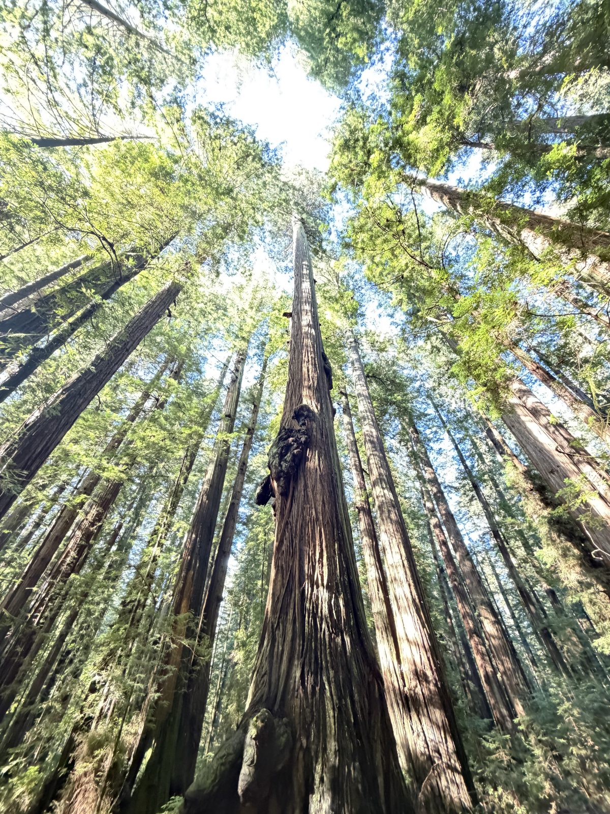
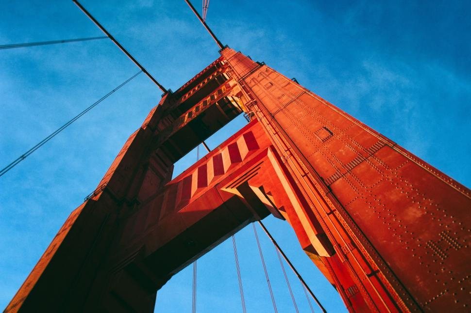
01Straight up a towerThe Bridge
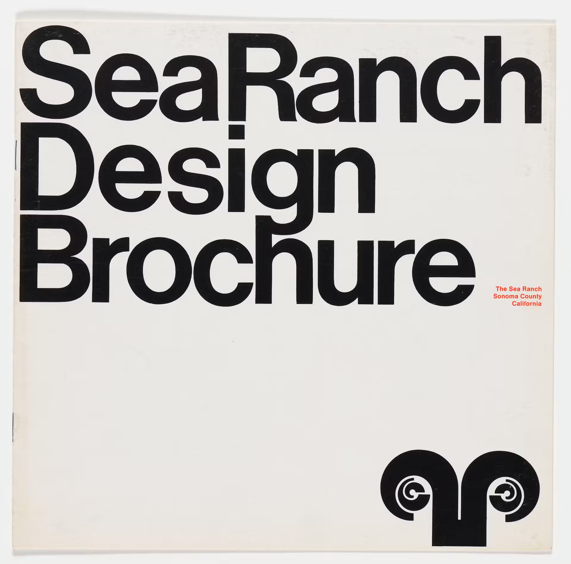
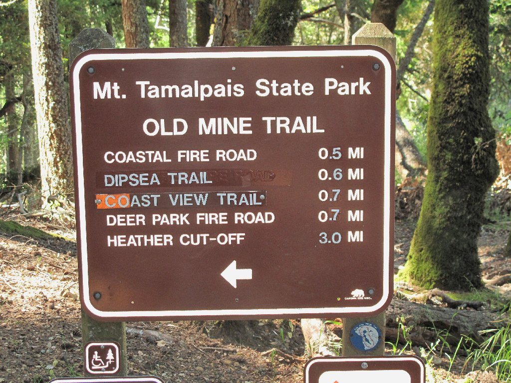
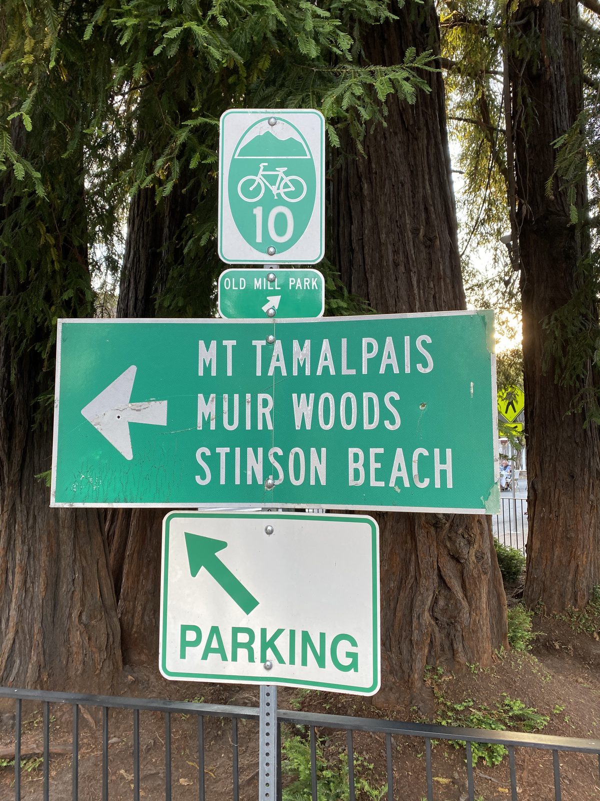
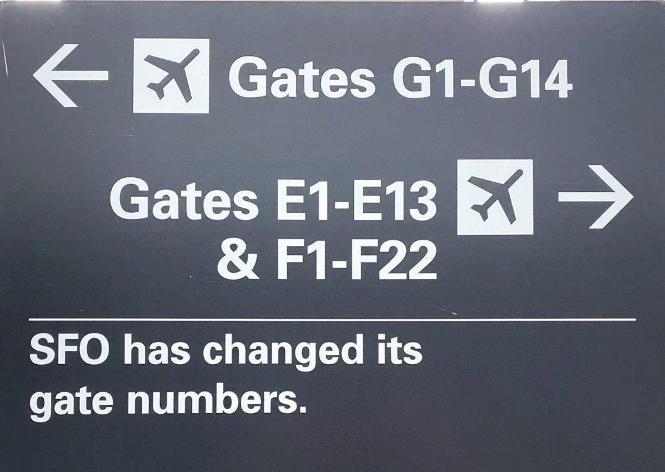
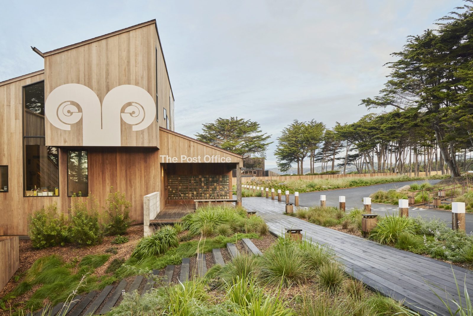
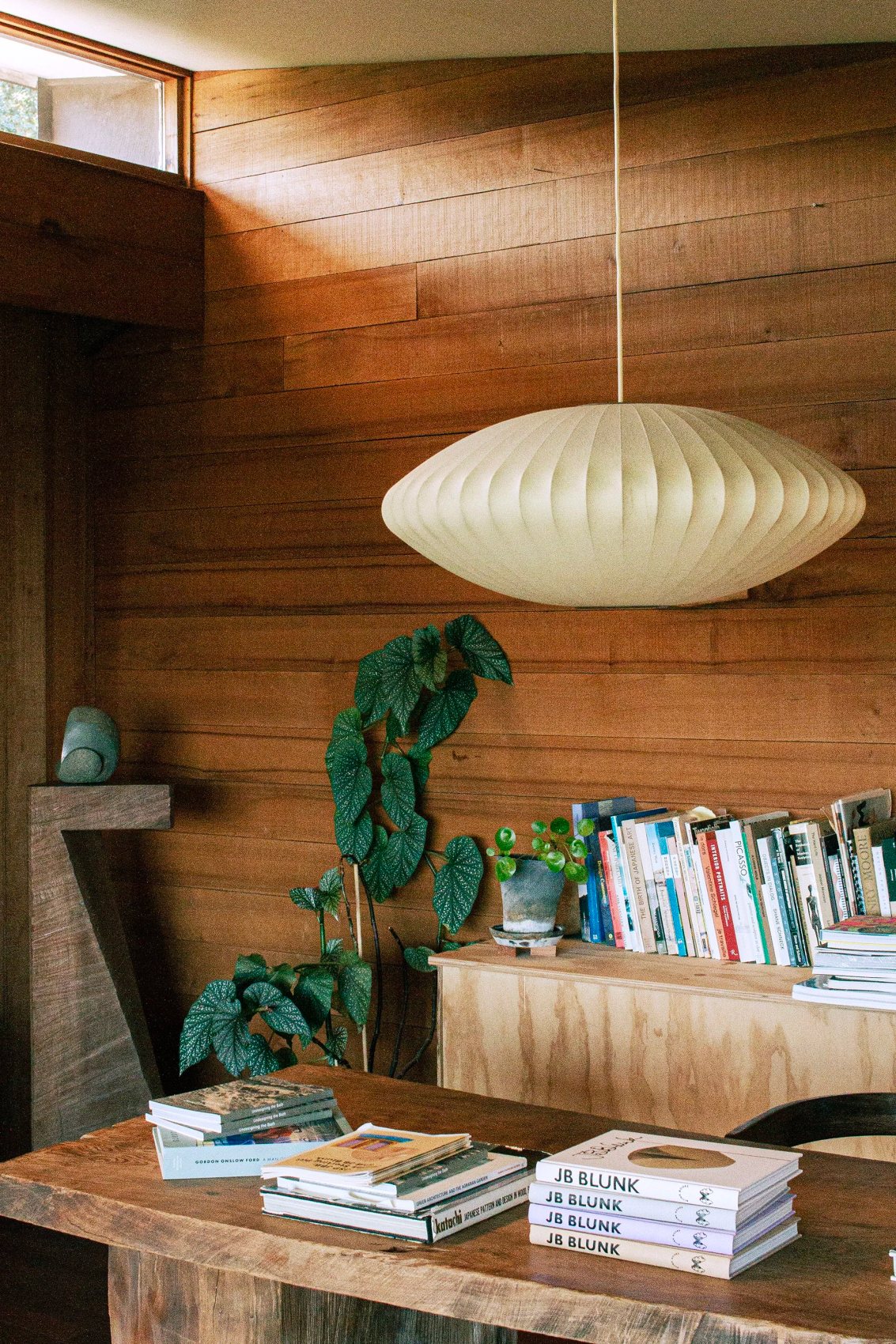
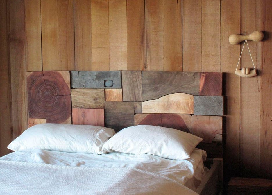
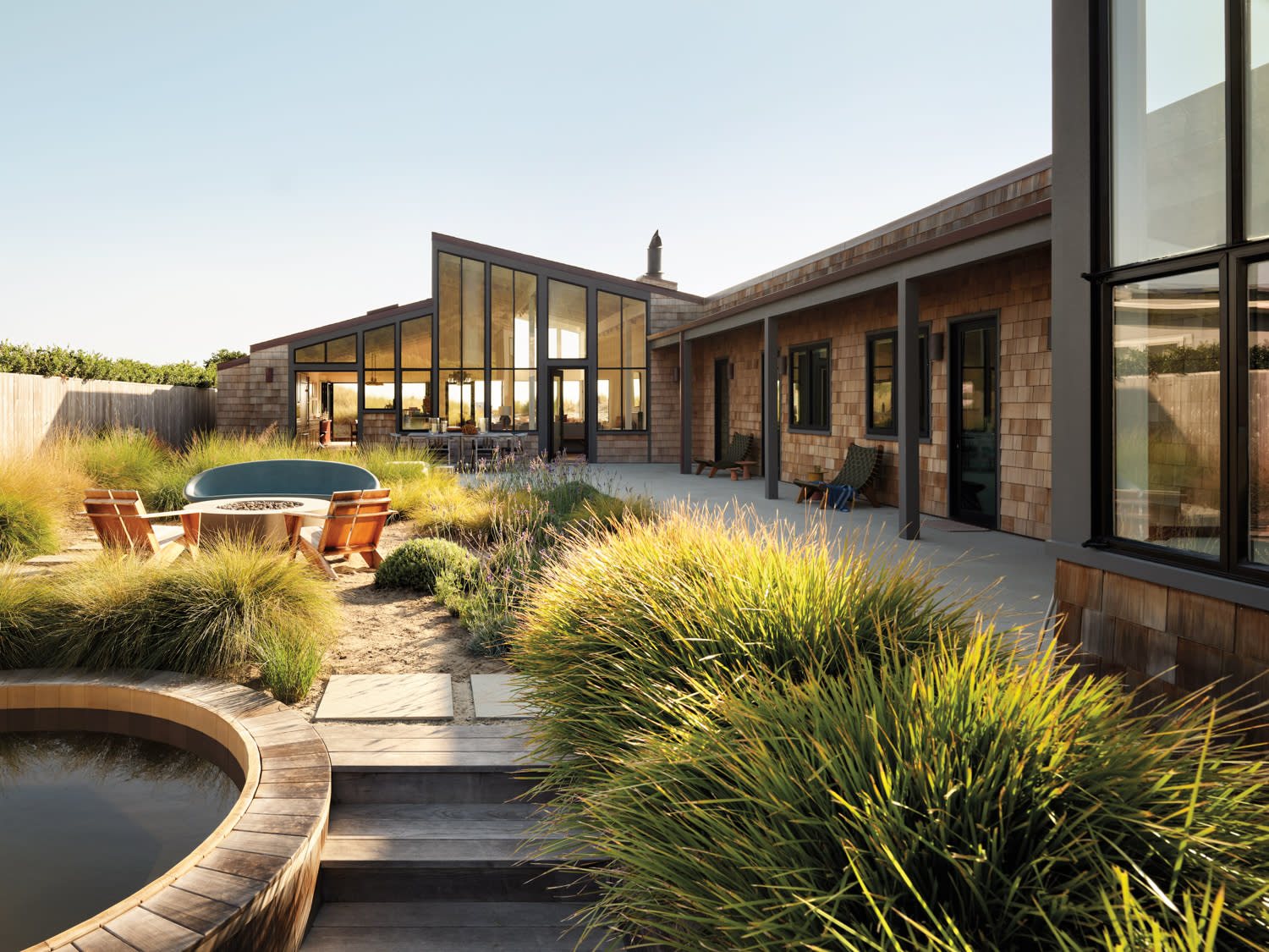
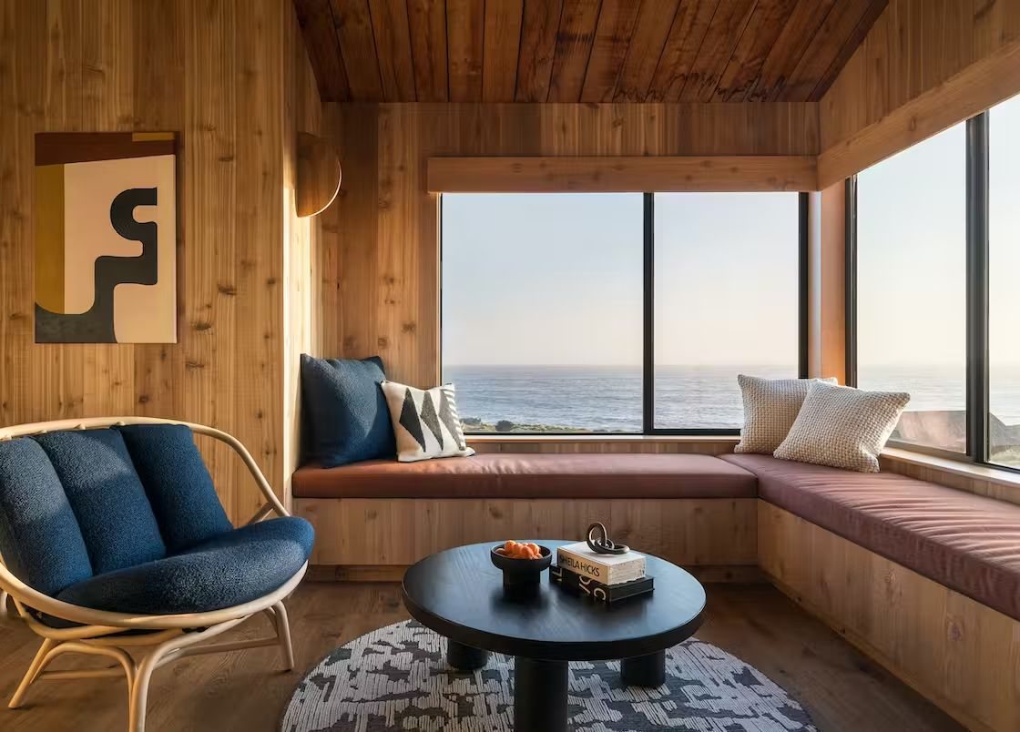
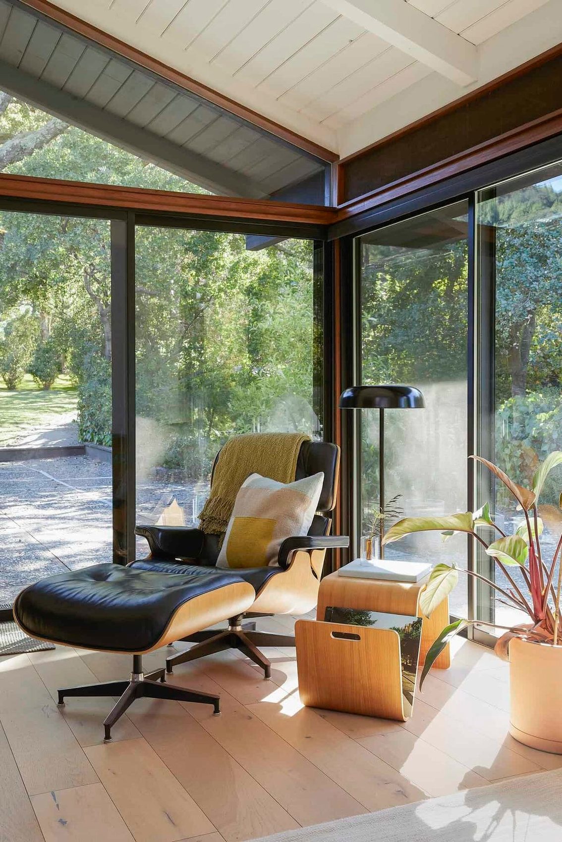
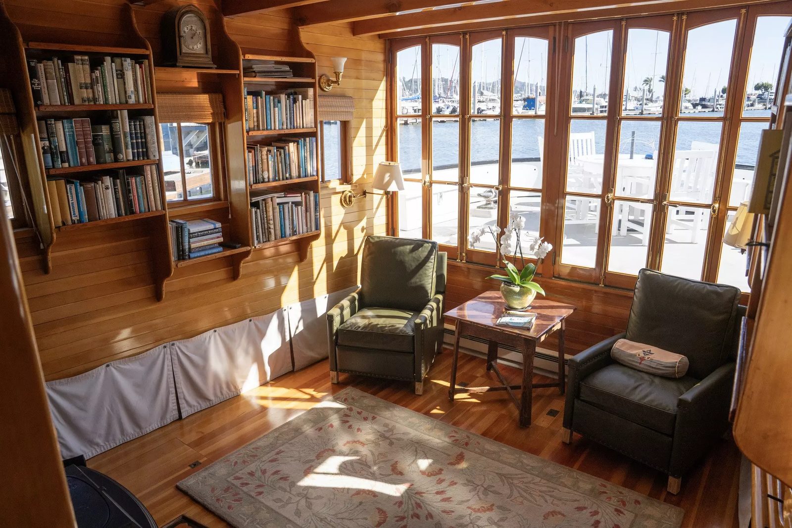
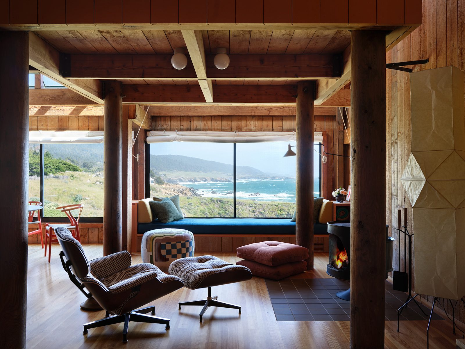
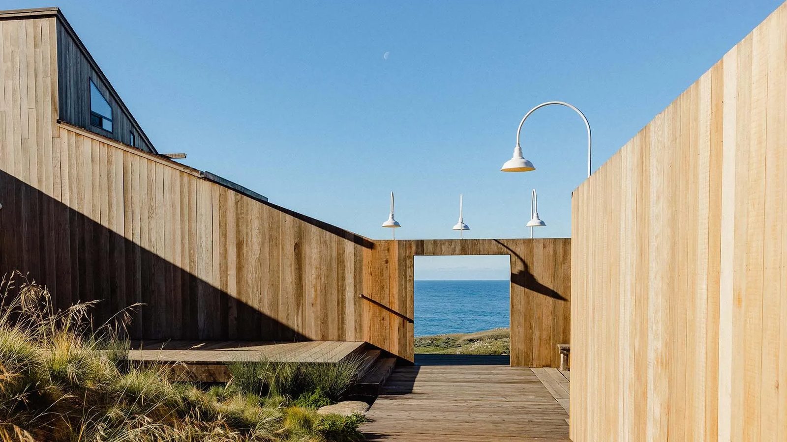
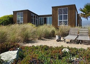
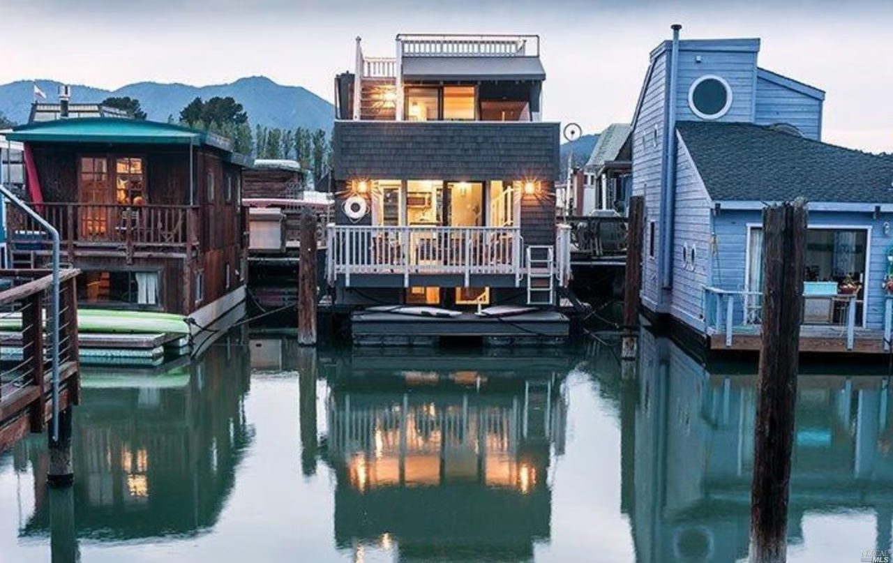
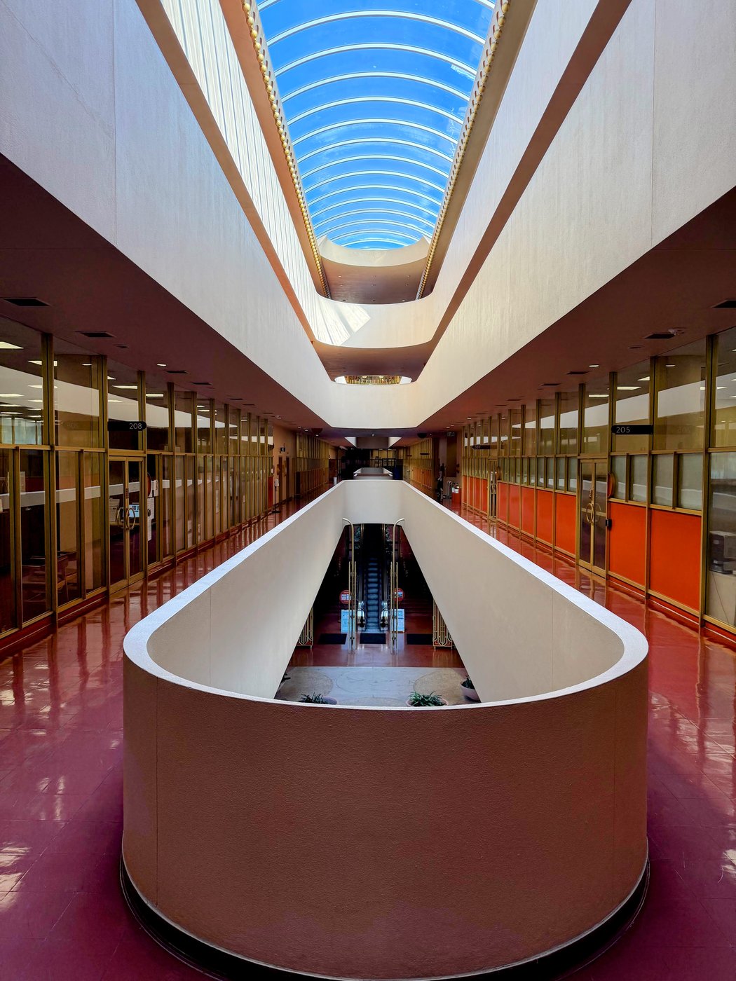
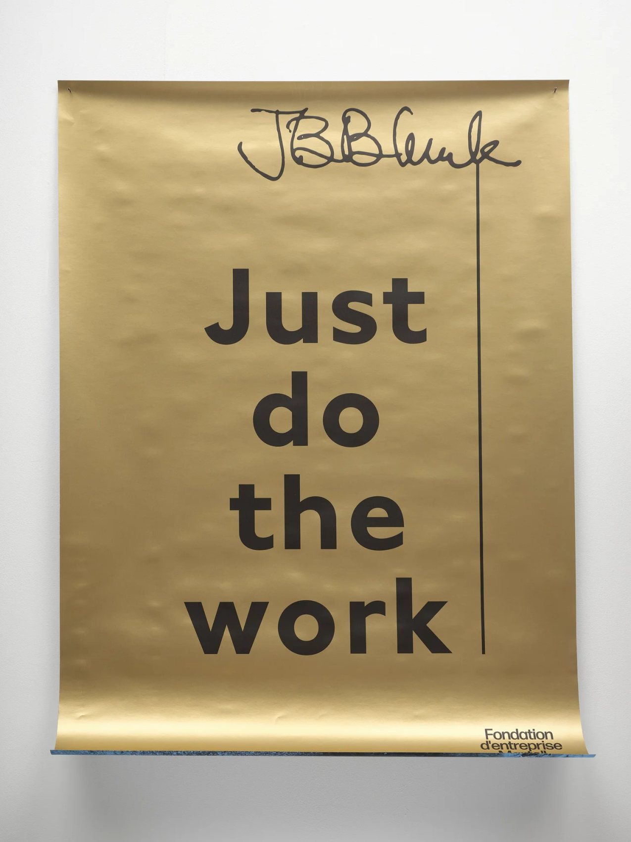
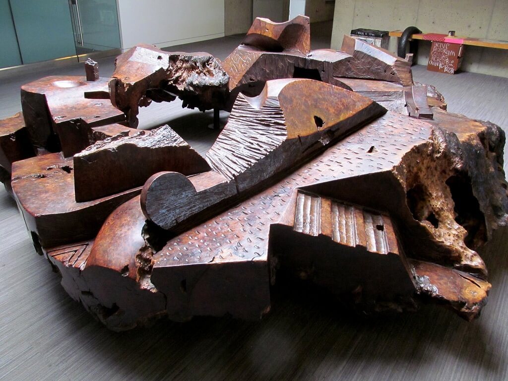
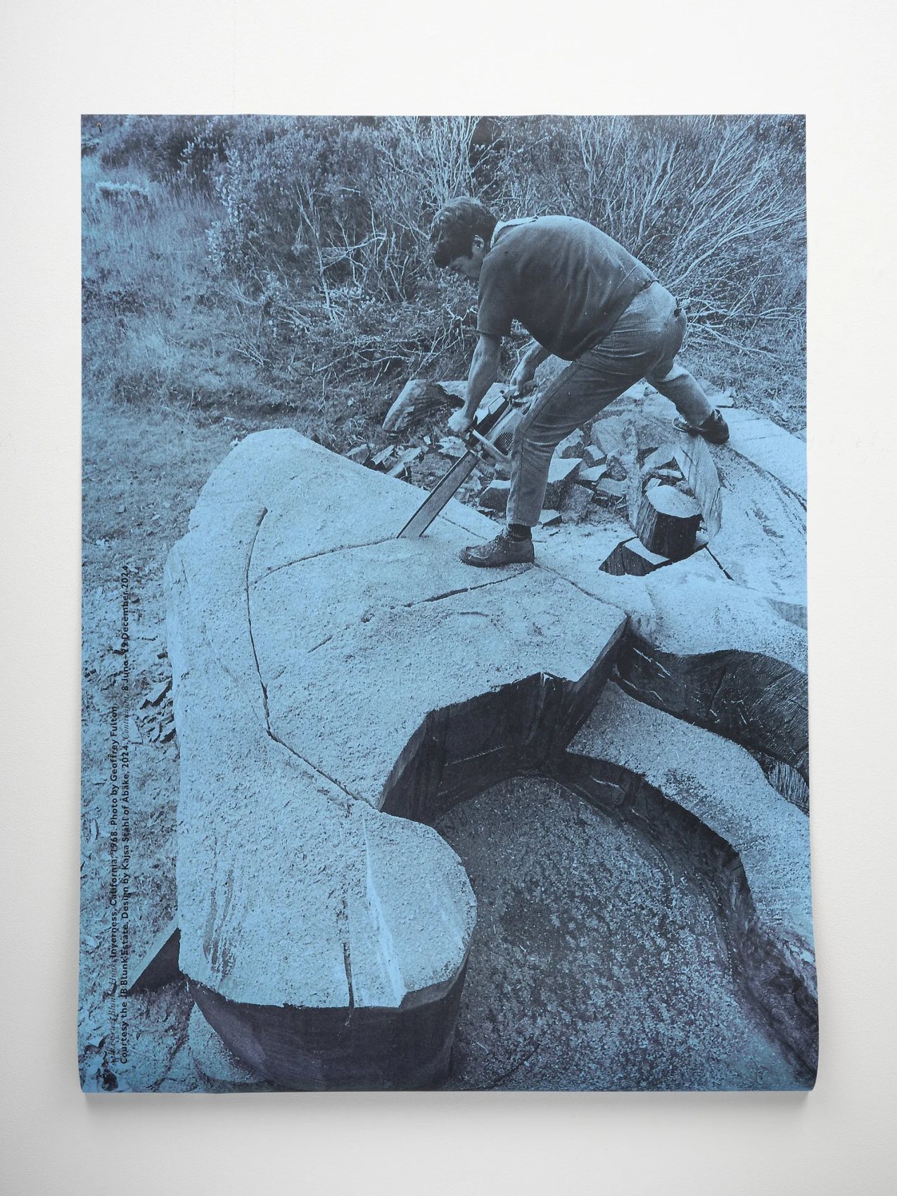
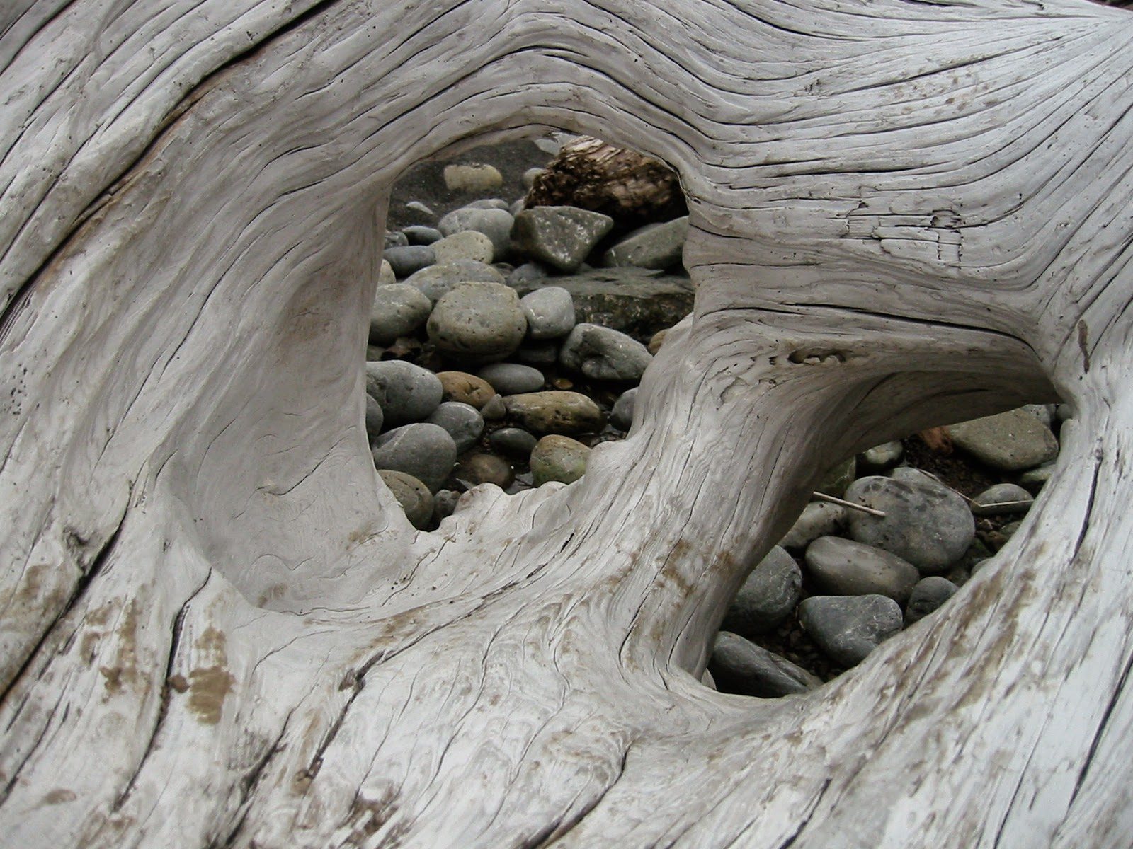
Northern California Modernism is less a style than a temperament. It shows up in JB Blunk leaving the saw mark in the wood, in Sea Ranch deferring to the hillside it sits on, in a road sign that moves a stranger with a seagull and a number.
The common thread is restraint. Nothing here is decorated. Everything is built, marked, or carved to be understood, and then left alone.
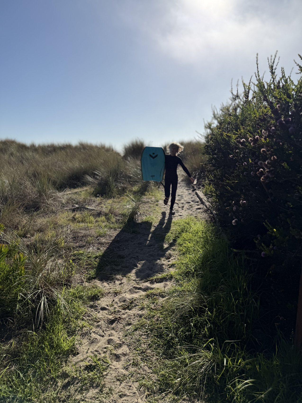
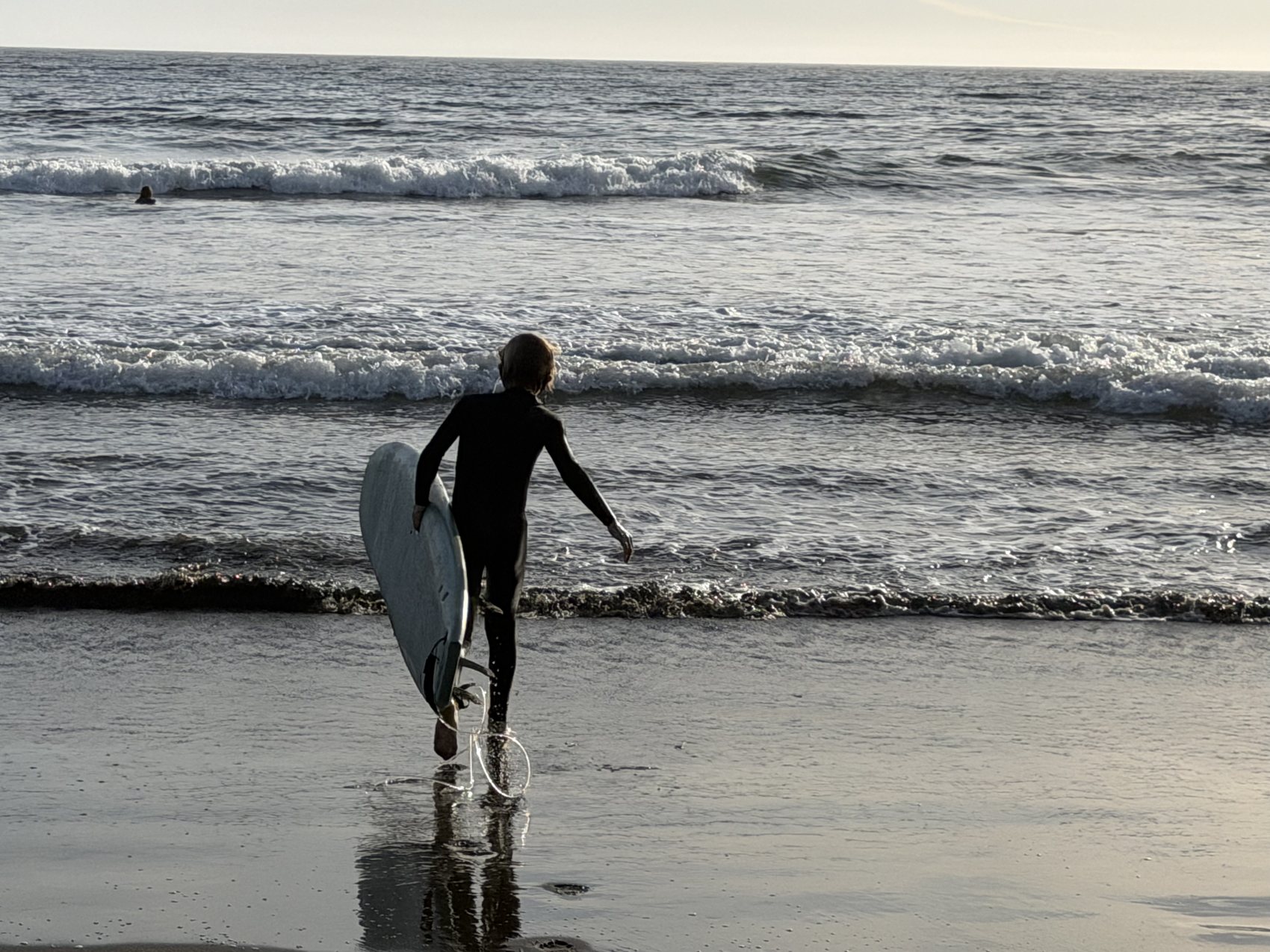
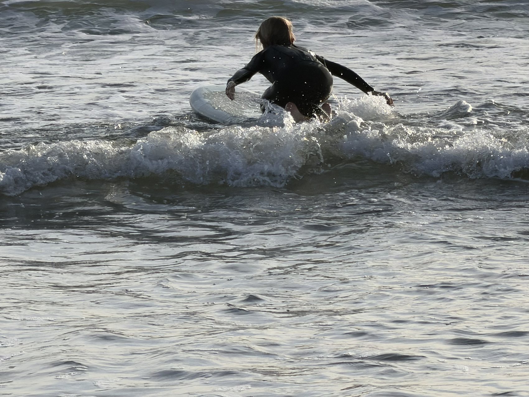
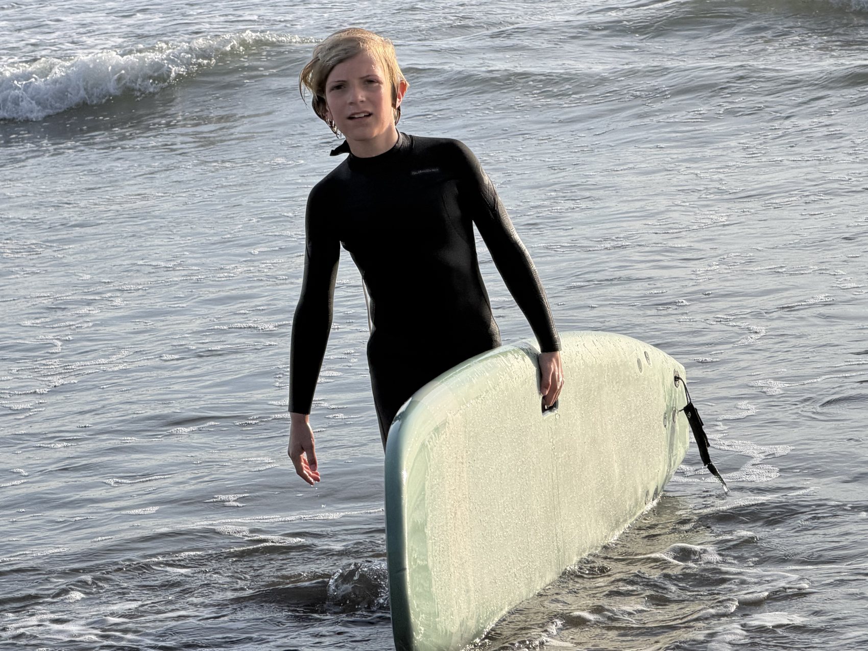
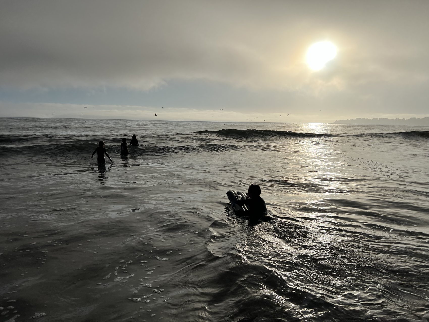
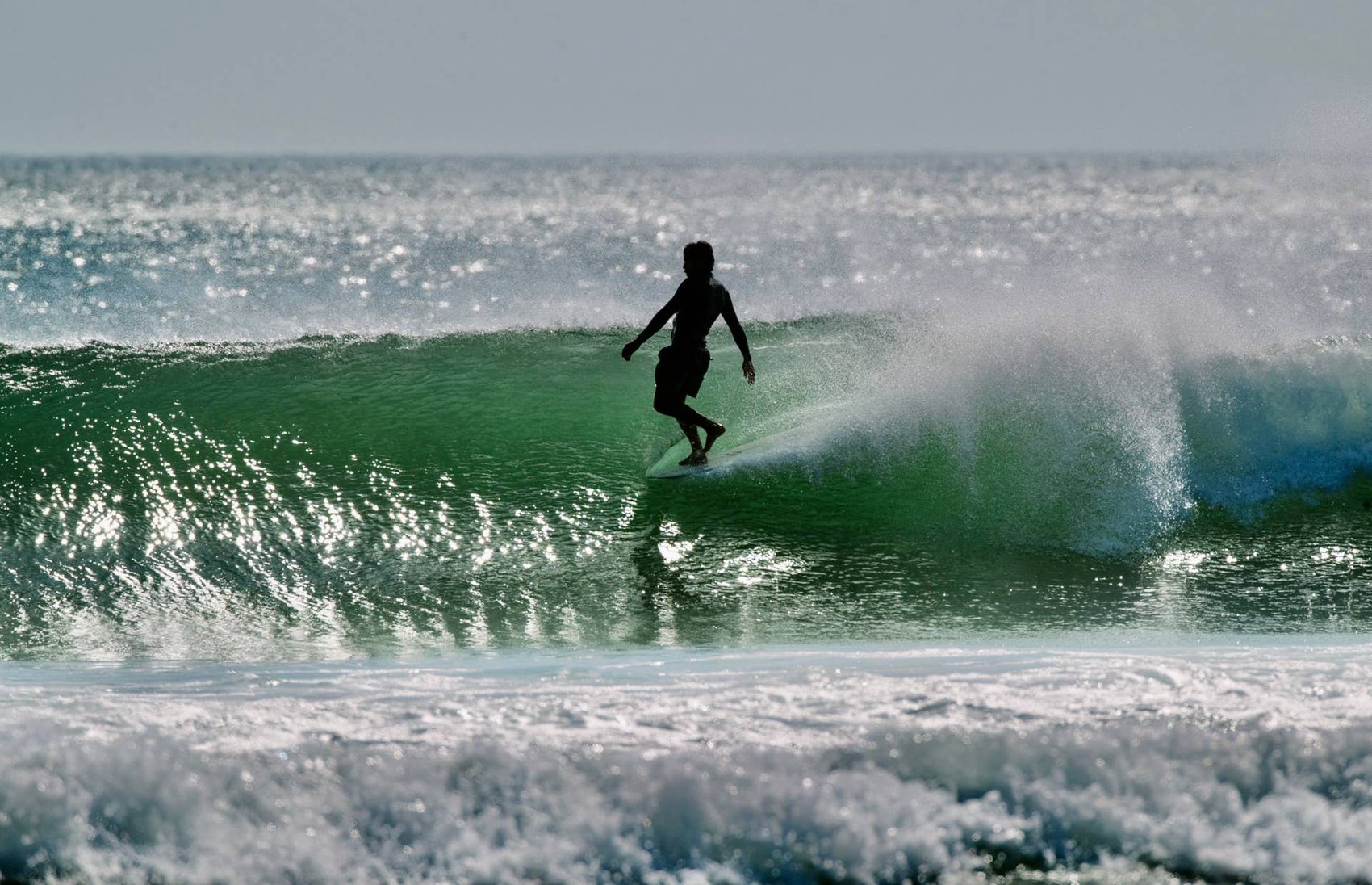
This board collects that temperament, from the bridge and the signage system to the architecture, the craft, and the land underneath all of it. It ends on a personal note, a set of photographs from days surfing Stinson Beach.
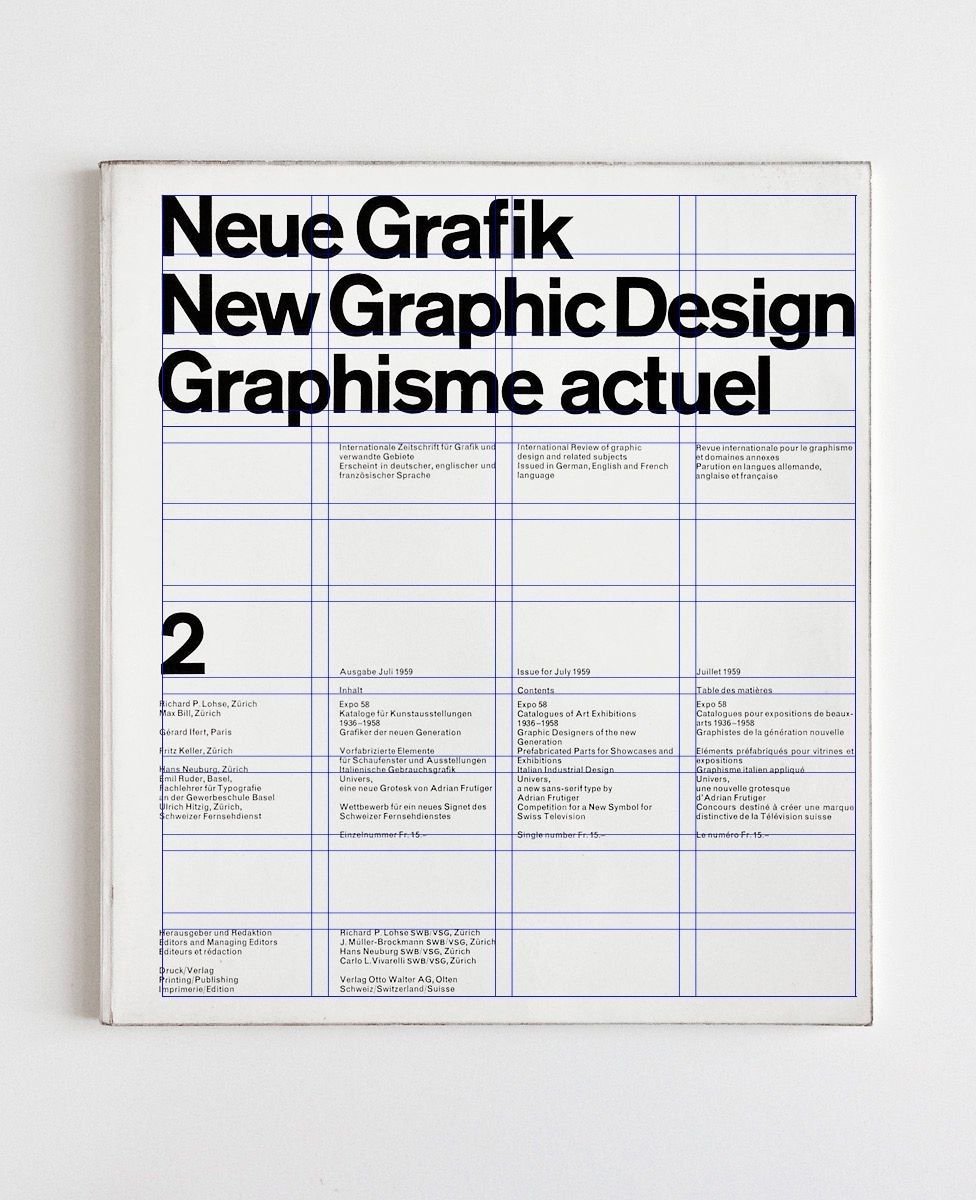
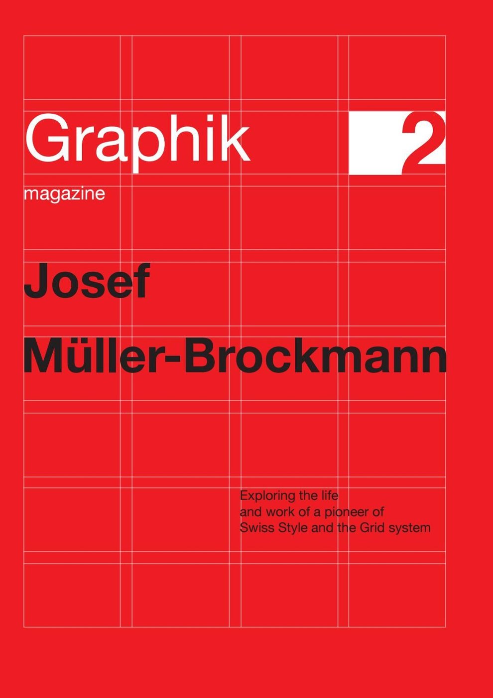
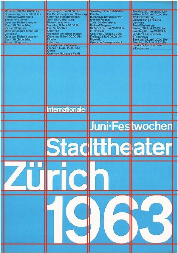
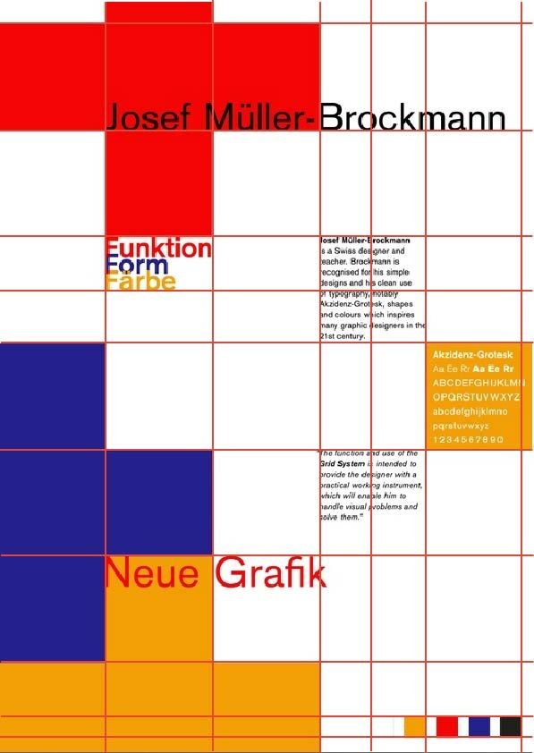
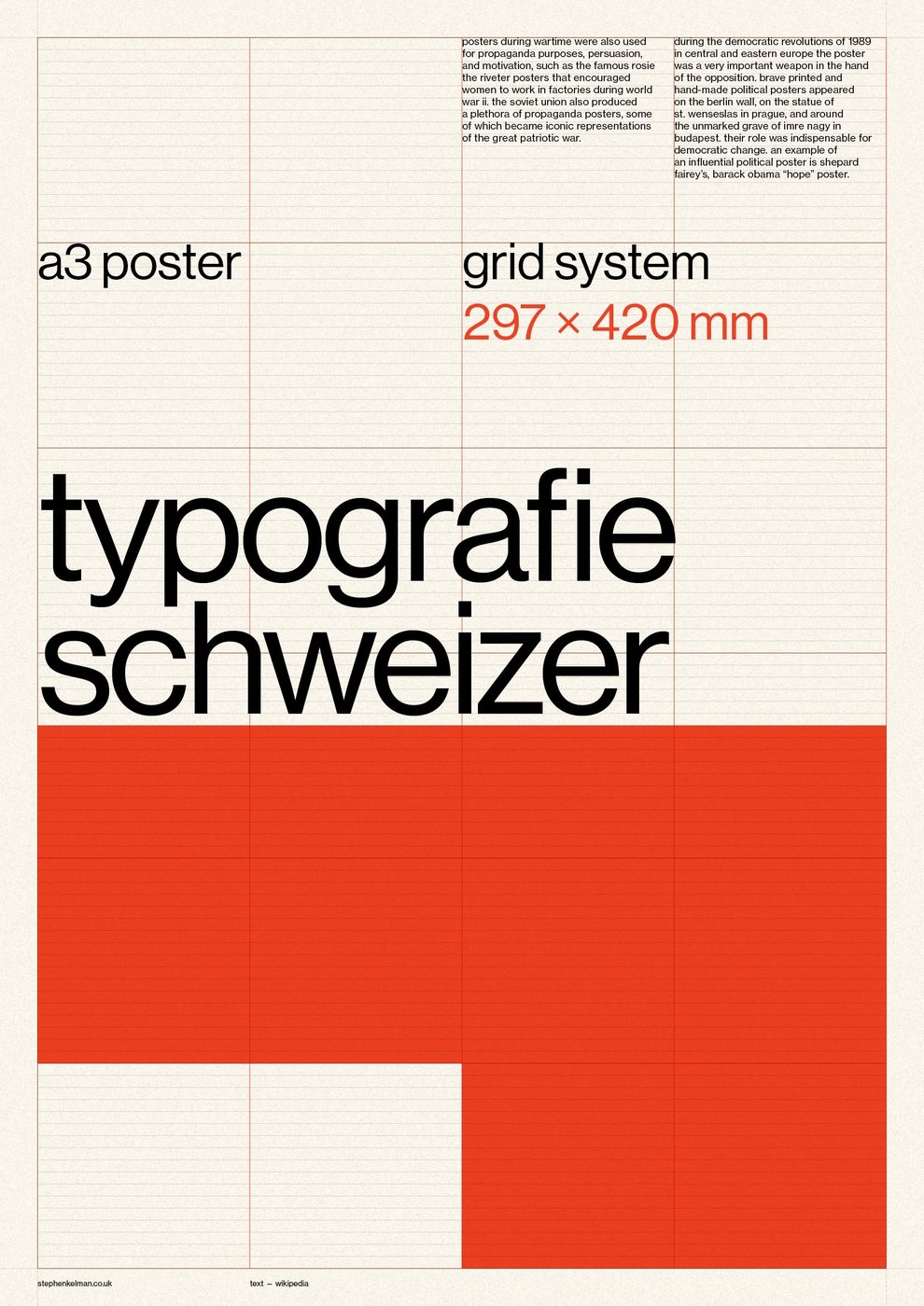
Swiss design is the tradition I keep coming back to. The grid, the objectivity, type treated as a neutral system instead of a signature. Switzer sits squarely inside it: even, low-contrast strokes, open counters, terminals cut without ornament. It is built to be read, not admired.
That is the whole argument for using it here. I have spent a career on information design, making dense, high-stakes information legible under pressure. Switzer is that instinct in a typeface. It carries a display headline and a paragraph of body copy in one clear voice, then stays out of the way.
It is what good information design looks like when it stops talking about itself.
Eight steps on the same 4px unit as the spacing scale, so one unit governs space and type. The 14 is the one deliberate exception. Uppercase set with 0.18em tracking reads optically larger than the same pixel size set lowercase, so lowercase data gets 2px back to sit level with the labels beside it. That is optical correction rather than drift. The top four steps are fluid and scale down on narrow screens; the numbers shown are their desktop values.
Twelve columns, 24px gap, inside a 1240px container. Every content edge lands on a column line; the bar is zero drift. Full-bleed media may break the container, content never does.
28 module
24 gutter
52 pitch, drawn to scale.
The 24px gutter is deliberately the same on both axes, so gutters
read identically across and down. That one shared number is what makes
two grids feel like one.
Every step is a multiple of 4, the same unit the type ramp sits on, so one unit governs space and type. Four steps carry the structure: the gutter, the module, and the two multiples of the pitch that set section rhythm.
The horizontal grid is the strict one. Blocks sit on explicit column spans, so a page can be checked rather than admired: turn the overlay on and every content edge should sit on a line. Zero drift is the bar.
The vertical grid is a rhythm rather than a lock. A block's top position is the sum of every variable-height block above it, and CSS cannot round that to a line. Section boundaries, headings and media land on the rhythm; a paragraph of unknown length pushes the next block a few pixels off. That is the honest limit, and it is fine. The goal is an order the eye reads, not a ruler-perfect snap.